What is Caravan UI
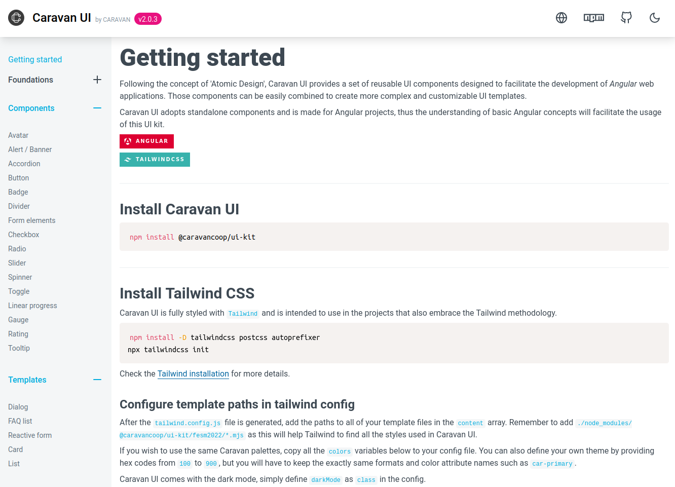
Caravan UI provides a set of reusable UI components to facilitate the development of Angular web applications. This was designed and developped as the internal asset for my team Caravan coop, and was intended to use for any internal project or client projects with limited design budget.
The conception behind Caravan UI is the famous Atomic Design, which initially guided me to create a design system and user interfaces in a modular and systematic way.
The idea was to break down a user interface into smaller and more manageable components in order to promote modularity, reusability, and consistency in our design system. Those components can be easily combined to create more complex and customized UI templates.

Here's how I did it
1. Prototype the design system in the Figma
This was the first step to build the foundation (color scheme, typography etc) and visualize everything we needed.
2. Develop the UI kit with Angular
Angular is our favourite front-end tool thus it makes sense to create an Angular component library. Angular supports the CLI to generate a library skeleton using ng generate library, it comes with ng-packagr to compile and package the Angular library. However, this CLI only creates a library with one main entry point, I'd like to have multiple entry points (subentry points) for better scaling. I've done therefore some modifications of the default structure.
3. Adopt Atomic design with Tailwind
Based on atomic design, I've categorized all our visual elements as atoms, molecules, organisms and template.
- Atoms (the basic building blocs): color, typography, spacing, grid, shadows, icons.
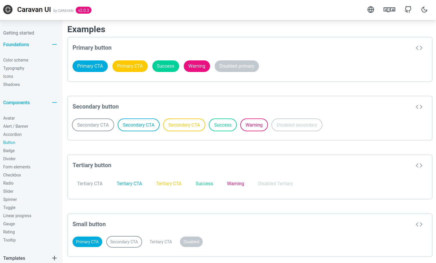
- Molecules (a combination of atoms): buttons, tabs, alerts, accordians, avatars, form inputs, sliders etc.
- Organisms (a combination of molecules): sidebar, modal, card, list etc.
- Template (formed by many organisms): hero banner, contact form etc.
I use Tailwind, a utility-based CSS framework, because all the atoms have been already defined to guarantee the clean consistent UI. I've then built on top of it all the rest components, from a simple button to more complicated cards or reactive forms.
4. Test locally with a tarball file
Before publishing the library, it's always good to test it locally. First, npm run build to build the ui library, then navigate to the dist directory to pack the library with npm pack, this will pack the library to a tarball file, which is essentially the same format when installing a package from npm. Simply install this tarball file to another empty Angular project like the code below:
npm install caravan-ui-kit-0.0.1.tgz
And import any component to test such as:
import { ButtonComponent } from '@caravan/ui-kit/button'
5. Publish the UI library as a NPM package
Now here's the step to publish! Update the version: Whenever publishing for any new feature or small patch, remember to update the version number in package.json and README. I also keep a CHANGELOG to track every change, it will be clear in the future to understand what has been done.
Tag the version:
git push origin <branch-name>
git tag <tag-name>
git push origin <tag-name>
Build and publish:
npm run build
npm login
# navigate to dist/caravan/ui-kit
npm publish --access public
After all, the package will be available to install from the NPM.
What have I learned
Maintentaining a package is as important as creating the package.
We've found many things to fix and improve while using this UI library in some real Angular projects. It has gone through two main versions, with the first version using SASS and second version using Tailwind.
We've decided to use Tailwind because writing SASS all from scratch just shipped too much dead code in the final package. Besides, Angular17 was officially released after Caravan UI first version, we've thus also decided to fully use standalone components.

